Go!
Wednesday night we had our first technical crew meeting. Our fabulous stage manager hosted (thank you Lyn!) and Claire & David, our brand-new design team, showed us a model with their ideas for the set.
Our usual designer, Alan, keeps telling us that he wants to take time off from designing and building sets (though on most productions he will turn up with a fantastic idea and then build it anyway!) so this time around we've granted his wish.
Claire and David have been involved backstage with quite a few productions. Claire has wanted to do some set design for a while and the ideas she presented on Wednesday show a great flair for the job, even on a set which I asked to be very simple - just two standalone doorways and a window.
Most of the evening was spent discussing the set design and we batted around a few ideas about how it would work. Claire's going to incorporate a couple of changes - mainly simplifying the build of the window and swapping over the two entrances, from left to right and vice versa. We also discussed and settled on the colour scheme.
David has some great ideas for how to build the set and we're going to spend some time rooting around in our storage/build/rehearsal hut on Sunday to find flats which we can incorporate into the set.
Also on the agenda was wardrobe. My Mum is looking after this and already has lots of great costume ideas and has started sourcing materials and patterns.
We touched briefly on sound and lighting, but at this stage we don't have our personnel - our preferred lighting guy is happier getting involved a bit later in the process.
After 3 hours of enthusiastic and productive talk we finished up. Now we're looking forward to a reading and two audition sessions next week...
Showing posts with label Design. Show all posts
Showing posts with label Design. Show all posts
Friday, 22 February 2008

Friday, 28 December 2007
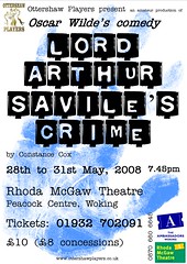
New Poster Design
I wasn't altogether happy with the posters I'd designed previously, so I got some advice from a professional poster designer on what may have been wrong with them.
His advice was spot-on and helped me to see some of the mistakes I'd made.
The concept was OK, and I've kept that (thanks Jo!) but the old poster was too 'busy' and cluttered and one's eye didn't know where to look next. Hopefully I've addressed the issues and made a design which is clearer, more concise and easier to read.
Click the poster over to the right there and let me know what you think...
His advice was spot-on and helped me to see some of the mistakes I'd made.
The concept was OK, and I've kept that (thanks Jo!) but the old poster was too 'busy' and cluttered and one's eye didn't know where to look next. Hopefully I've addressed the issues and made a design which is clearer, more concise and easier to read.
Click the poster over to the right there and let me know what you think...
Subscribe to:
Posts (Atom)