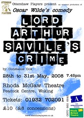
I wasn't altogether happy with the posters I'd designed previously, so I got some advice from a professional poster designer on what may have been wrong with them.
His advice was spot-on and helped me to see some of the mistakes I'd made.
The concept was OK, and I've kept that (thanks Jo!) but the old poster was too 'busy' and cluttered and one's eye didn't know where to look next. Hopefully I've addressed the issues and made a design which is clearer, more concise and easier to read.
Click the poster over to the right there and let me know what you think...
Friday, 28 December 2007
Subscribe to:
Post Comments (Atom)


2 comments:
Dunno who ya professional advisor is but thats spot on.
Pete Can see the point about the busyness of the other ones and agree you've improved on what was already a good concept and poster. Hope the play is coming along equally as well.
Post a Comment